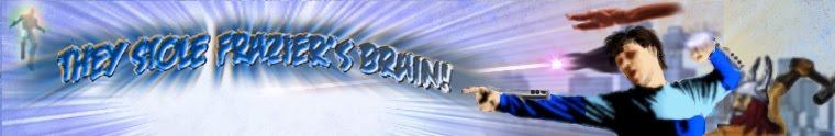
Looking at the logo I did, it occurred to me that it wasn't so much the shape of the font that made it seem so cartoony, but just the bright flat colors. So I toyed with muting the colors a bit and adding some grunge texture. It looks more interesting now.

I'm putting together a rough concept of a proposed cover that may take a while to finish, but right now, I've got some free time on my hands.


No comments:
Post a Comment